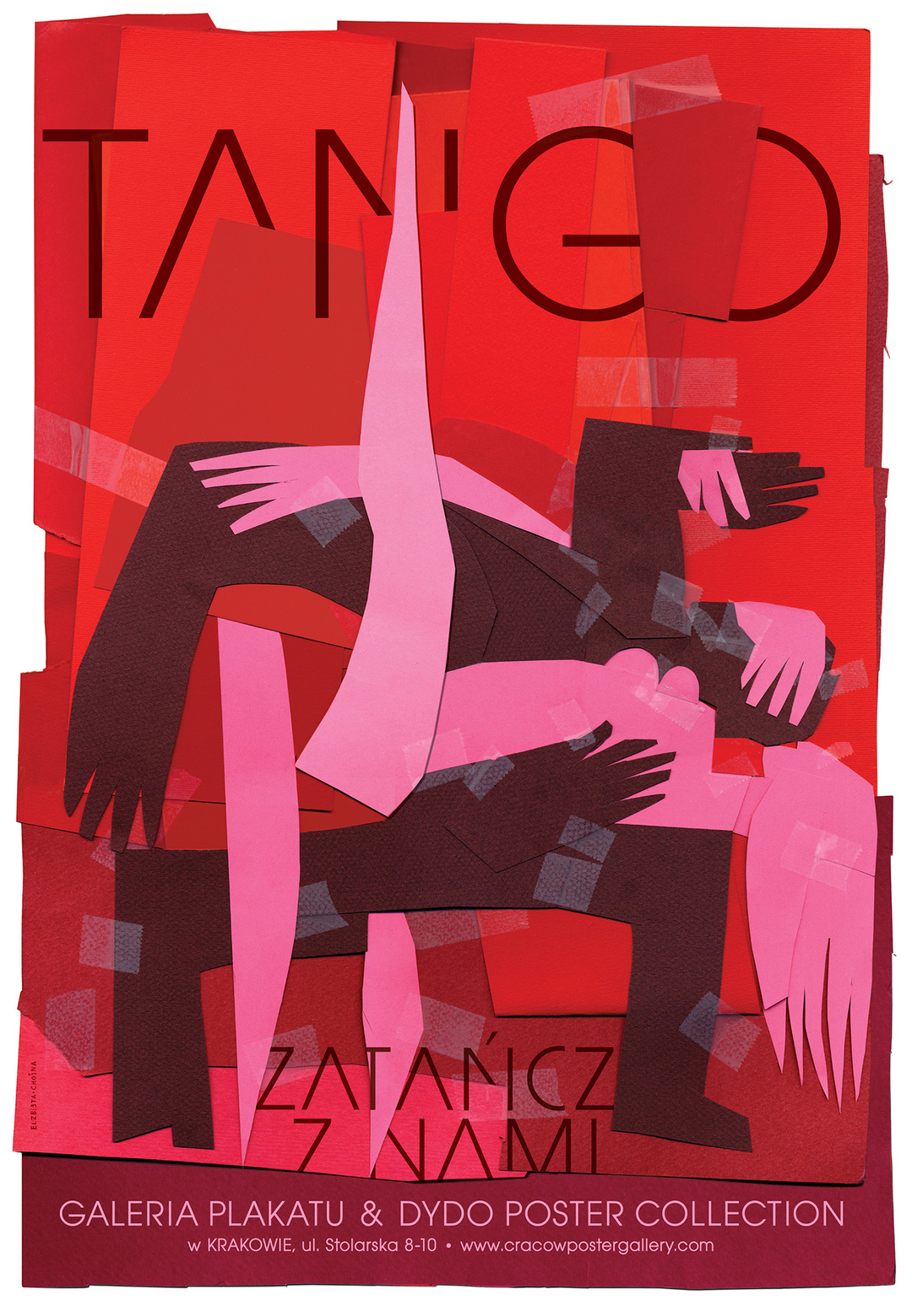
The eye is busy. How many hands, arms, and legs, bent and intertwined, can it capture in the poster that Elżbieta Chojna designed for the dance evening Tango in 2008? An attractive work of art has emerged, cut out of red and black paper with rough contours and collaged together, enticing you to contemplate for a while. You can already hear the tango beat.
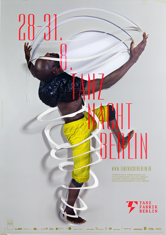
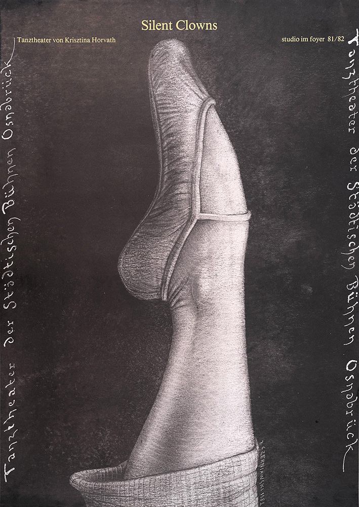
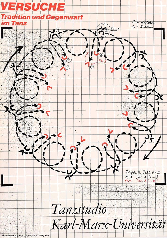
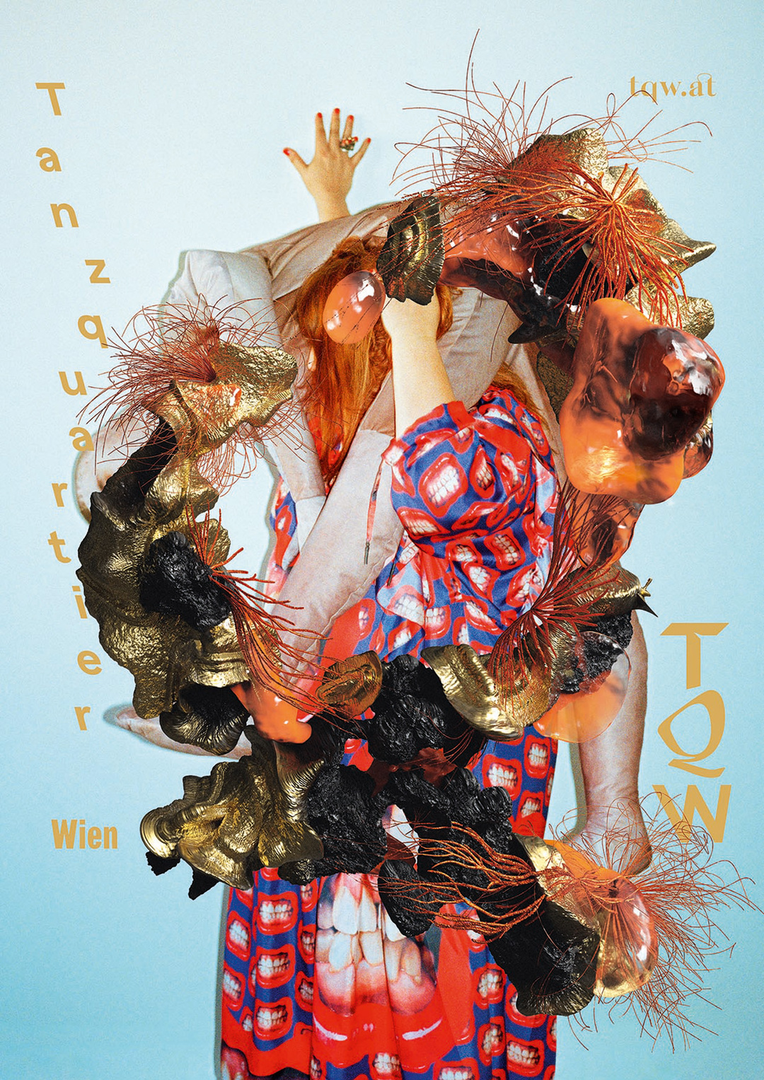
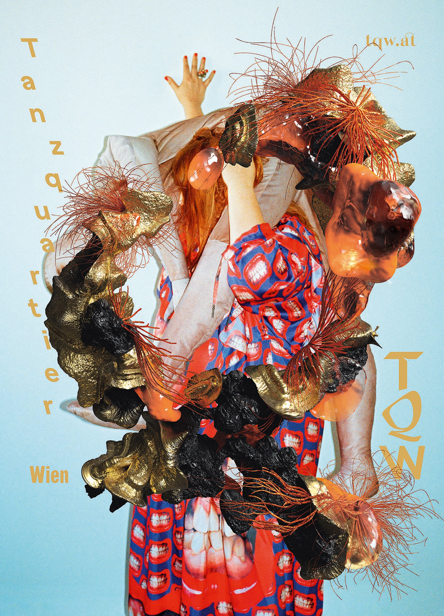
What can a poster say about dance and movement? How does it convey more than a frozen moment? This can be wonderfully studied in the exhibition Bewegte Blätter. Tanz im Plakat at Dieselkraft Cottbus, featuring works by 70 designers since the 1960s. Poster art has been collected at Brandenburgisches Landesmuseum für Moderne Kunst since the 1970s, because in the GDR, applied art was meant to be on an equal footing with the fine arts. Documenting the history of graphic design as well as the history of dance, this exhibition benefits from this. It tells its story through individual posters as well as series that stretch up to the ceiling in a high-ceilinged space. The design agency cyan studio, for example, has created an entire block of posters for cie. toula limnaios, an independent group from Berlin. They are based on photographs of dynamic moments in the choreographies, whose energy is further enhanced by the visual treatment and poetically exaggerated with blurred gray tones. Another series comes from the Viennese design and branding agency studio VIE, promoting the Tanzquartier Wien with a surreal, mysterious visual rhetoric. Magnificently shimmering, amorphous forms reminiscent of shells, corals, and butterflies overgrow fragments of faces and bodies on these posters. Here, dance is embedded in the organic processes of all living things; it is less about promoting a specific event than about an institution that reflects on it.
With various posters for the ballet Coppélia, the exhibition demonstrates how diverse the paths of translating dance art into the graphic arts can be. In 1993, Kathrin Kegler designed a poster for the Komische Oper Berlin that uses expressively painted figures to tell a story: blood is flowing, a woman is being picked up, and disaster is in the air. Holger Matthies on the other hand used a photographic nude of a woman from behind, into which he incorporated a small flap: it opens a view into a machine.